Visual communication for medical writers
“A good sketch is better than a long speech”. This quote, often attributed to Napoleon Bonaparte, underscores the importance of effective visuals in medical communication.
There is no disputing the axiom that visuals are crucial in medicine. This is exemplified by the early and world famous ‘De humani corporis fabrica libri septem’, the anatomical handbook written and illustrated by Andreas Vesalius, which used woodcut blocks for its images and was published in 1543. Fortunately, technological advancements have made it much easier to create various types of visual supports today. In this article, we offer several examples of how visuals can be integrated into medical communications and regulatory medical writing. We also discuss the benefits that result from the targeted use of appropriate visual aids.
Visuals in medical communications
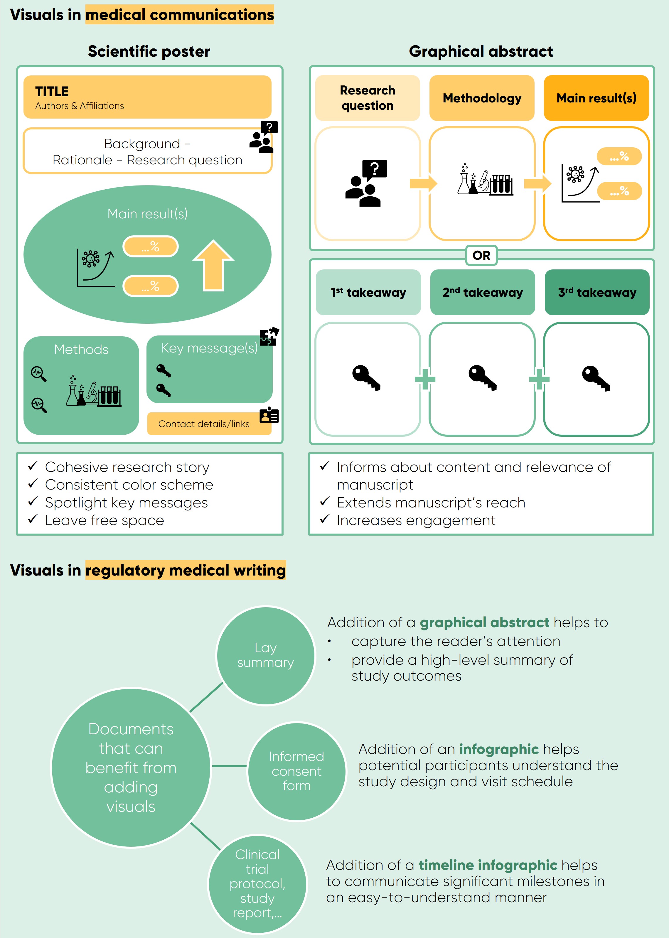
One of the foremost examples that may come to mind when considering visuals in medical communications is probably the scientific poster, used to present research findings at scientific conferences. Traditionally, a scientific poster was a large, text-heavy piece of paper that typically attracted only a few specialists. In recent years, however, the scientific poster has evolved to an eye-catching piece of graphic art attracting larger audiences [1]. A visually appealing scientific poster uses images to convey a cohesive research story. The most important results are showcased through graphs and diagrams, with text playing a secondary role. Effective posters adhere to a consistent color scheme, spotlight key messages, and avoid overcrowding by leaving ample free space. The ultimate goal of a scientific poster is to increase the exposure of research findings by making the main message stand out from afar and serving as a conversation starter among experts. Additionally, it acts as a medium for networking and increases collaboration opportunities.
While visualizing data in medical publications with graphs and tables is common, using visual support to replace written text is not. However, in recent years, this practice has been encouraged, with medical journals requiring a graphical abstract for manuscript publication. A graphical abstract is a visual summary of research designed to inform readers about the content and relevance of a manuscript at a glance [2]. Though not part of the manuscript itself, it is displayed in online search results and on webpages. Sharing a graphical abstract on social media effectively disseminates research findings. A visually compelling graphical abstract extends a manuscript’s reach, attracting readers and increasing engagement.

Visuals in regulatory medical writing
Although less commonly associated with regulatory medical writing, visuals can be a useful tool in various regulatory document types. An example is adding visuals to a lay summary, a document aimed at informing nonspecialists about clinical trial results [3]. A graphical abstract may capture the reader’s attention and provide a high-level summary of the study outcomes. It is crucial to ensure that such graphical abstracts remain strictly objective and non-promotional. Similarly, adding visuals to an informed consent form can help potential participants understand the (often complex) study design and visit schedule of a study to which they are invited to participate in.
Other regulatory document types, including clinical trial protocols and study reports, can benefit from infographics to present the study schema [4]. Timeline infographics communicate significant milestones, including study periods, visits, assessments, and treatment arms in an easy-to-understand manner. In view of increased transparency, complex documents become thus more accessible to a general audience.
Emtex writers are experienced in presenting complex information in a clear and unambiguous way. They can help with creating visuals for both medical communications and regulatory documents, tailored to the client’s needs. Refer to our infographic on visuals accompanying this article.
References
[1] T. Rossi, F. Slattery and K. Richter. The evolution of the scientific poster: From eye-sore to eye-catcher. Medical Writing, vol. 29, no. 1, 2020.
[2] K. Martin. A picture is worth a thousand words. Medical Writing, vol. 29, no. 1, 2020.
[3] T. Schindler, K. Summerer, L. H. E. Leithold, K. Sroka-Saidi and C. Brown. Enhancing accessibility of study data: The development of a graphical abstract for lay summaries of clinical trial results. Medical Writing, vol. 29, no. 1, 2020.
[4] L. Navon-Perry, J. Raskind and S. Stein. Leveraging infographics in study schemas. Medical Writing, vol. 29, no. 1, 2020.